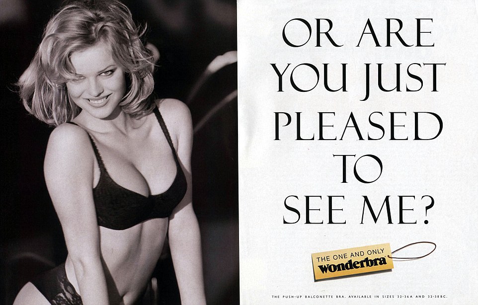
Famed for its attention-grabbing campaigns and iconic models, the Wonderbra brand became a sensation in UK and the rest of Europe from the early 90s. Since then it has expanded from the simple push-up design, into a full range of lingerie, boosting women’s cleavage and self confidence!
With a sassy, free-spirited, autonomous brand voice, we were tasked to combine Maidenform and Wonderbra without losing the recognition of the brand or it’s identity. Once finalised, this new logo had to be carried through to a comprehensive global brand guide, showing how to use the logo across all media, and new packaging for the full Wonderbra range.
The new logo needed to fully integrate the two brands without compromising the identity of Wonderbra. Brand recognition needed to remain strong but otherwise we were given creative freedom to come up with some solutions.
The final logo design combined the “Wonderbra” in its traditional font, incorporating the “M” design and magenta colour of Maidenform. The “M” shape was manipulated to give a subtle suggestion of cleavage and the black and magenta colours created a strong, yet feminine, combination.